Pro Member
- Joined
- Mar 24, 2023
- Posts
- 46
- Likes Received
- 171
- Name
- Myles Baker
I've always struggled with landscape images, particularly composition. Occasionally I get one I really like.
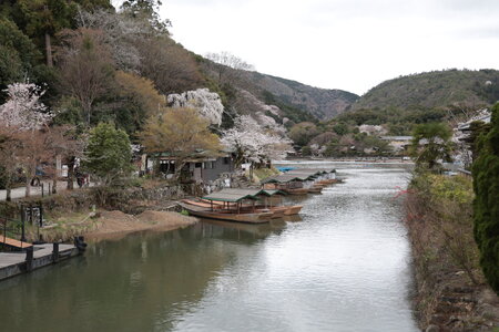
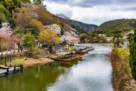
I'd like some critique of the attached image, starting with the composition and also the editing. Note: I do not have a calibrated monitor & tend to edit so that it looks good on a smartphone screen, which is how I normally share my photos and I have a tendency to over-saturate (personal preference).
I've attached the unedited raw file, my initial edit (jpeg) using Adobe Camera Raw & an additional edit where I have used Photoshop's oil-painting filter. I plan to print the oil-painting version on textured paper, because I really like the look of this as an oil-painting. The edited jpeg is much closer to how I saw the scene than the unedited raw.
The photo itself was taken with the Canon RP & the RF24-105 f4, handheld (I was traveling without a tripod) at f4, 1/320 of a second & ISO 100 at a focal length of 42mm, auto white balance, camera faithful. Because I was handholding, I used a faster shutter speed & wider aperture than I would have if using a tripod & I zoomed in to cut out a road to the left. The image itself is uncropped.
Any critique, positive, negative or anywhere in between is welcome.


